

The Topkapı Sarayı Müzesi Kütüphanesi in Istanbul preserves a bilingual manuscript from the Ghaznavid era, known as Tafsīr-i munīr MS. Istanbul TSMK EH.209 (fig. 1). Produced in 484 AH /1091 CE under the patronage of Sultan Ibrāhīm (r.451-92/1059-99). This manuscript represents one of the earliest surviving examples of a bilingual Qur’an exegesis, pairing the sacred Arabic text with a Persian commentary attributed to Abū Naṣr al-Ḥaddādī (d. after 400/1009). The volume itself is the work of the master calligrapher and illuminator ‘Uthmān ibn al-Ḥusayn al-Warrāq al-Ghaznavī. Currently, the library houses only the eighth volume of this monumental work. It remains a mystery whether the rest of it is sitting undiscovered in another collection, or if its folios have been dispersed across private hands long ago, or if the volumes were simply lost as a result of the various wars that shaped Central Asia and the Iranian plateau, particularly during the Mongol invasions.1 The analysis presented here is partly based on direct consultation of the manuscript at the Topkapı Palace Library, allowing a closer examination of its material features.
“It remains a mystery whether the rest of it is sitting undiscovered in another collection, or if its folios have been dispersed across private hands long ago, or if the volumes were simply lost as a result of the various wars that shaped Central Asia and the Iranian plateau, particularly during the Mongol invasions.”
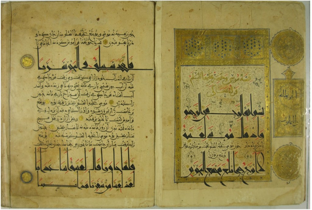
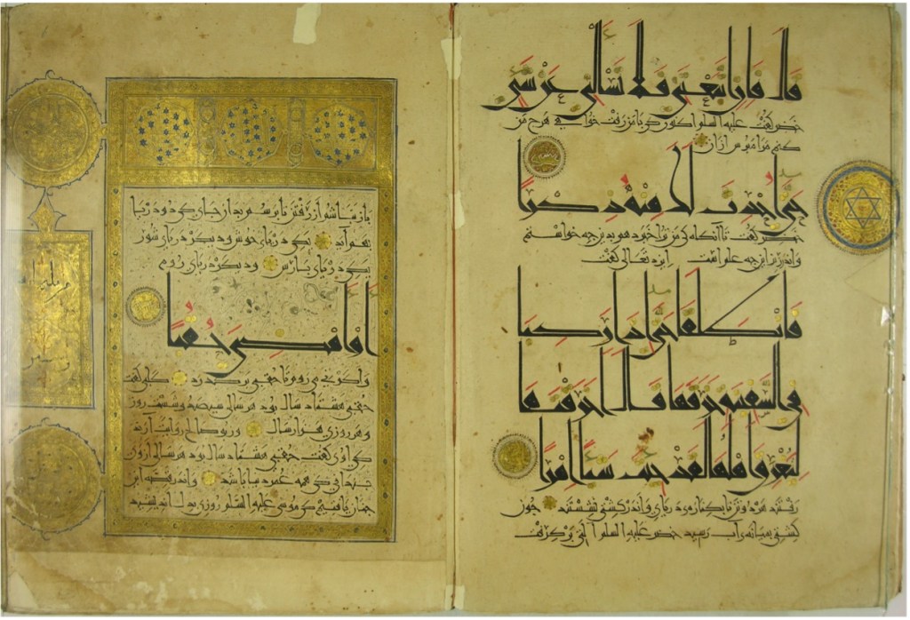
The manuscript is written on oriental paper which was standard choice in the eastern Islamic world at this time. It consists of 239 folios produced in a vertical in-folio format of approximately 340 ×240 mm. Each folio contains 10 to 19 lines where the calligrapher employed four different scripts to organize the text. The Arabic verses of the Qur’an appear in large script while the Persian commentary is written in smaller characters. This creates a visual harmony, a deliberate technique designed to guide the reader’s eye and to highlight the distinction between the sacred word and the interpretation. The current physical condition of the manuscript makes it quite challenging to determine the original types of quires. Notably, the order of the folios appear to have been altered during a later restoration. For example, folio 3v actually continues on folio 6r, suggesting that the restoration process disrupted the original sequence of the manuscript (Figs 1 and 2). This suggest that the restorer was not fully familiar with the structure of Qur’an verses. Furthermore, the current foliation is marked with Arabic numerals at the upper left corner of the recto folio. This numbering was almost certainly a later addition, likely added during a restoration or cataloging project.
The colophon ff. 238v-239r confirms the manuscript’s origin as a royal commission, using a series of honorifics that frame Sultan Ibrāhīm al-Ghaznavī as a staunch defender of the faith a common rhetorical device of the period. While folio 239v mentions the completion date of 484 AH/1091 CE, the site of production remains undetermined. Nevertheless, Alya Karame argues that the sheer quality of this manuscript points to a major artistic center in Ghazni.2
Beyond royal patronage, the manuscript reveals a prestigious intellectual lineage. The Persian commentary on folio 2r is attributed to the Samarkand scholar Abū Naṣr Aḥmad ibn Muḥammad ibn Ḥimdān al-Ḥaddādī. Interestingly, the margins and ornamentation offer glimpses into the collaborative nature of the workshop. An eight-pointed star on folio 85r bears the signature ‘amal Muḥammad (the work of Muḥammad), possibly the scribe’s son. Another hand, identified only as ‘Alī, appears in the marginal medallions (f. 7v) with the note dhahhabahu ‘Alī (illuminated by ‘Alī), indicating he was responsible for the illumination.
“The manuscript bears the physical scars of later sectarian shifts.”
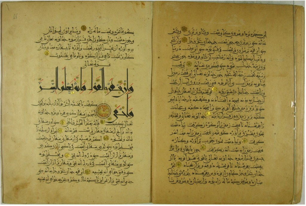
Notably, a waqf inscription has been lightly scratched into the upper margins of folio 52v-53 and in « 87v-88r a subtle, inkless marking that designates the volume as an endowment (fig. 3). Despite its royal origins, the manuscript bears the physical scars of later sectarian shifts. The name of the third Caliph, ‘Uthmān, was deliberately erased on folio 72r, and on folio 238v, ‘Alī was even written over the calligrapher’s own name, which happened to be ‘Utmān as well. These alterations likely date to the Safavid period when the manuscript was kept in Iran, as Karame suggests, reflecting the Sunni–Shi‘i tensions of the era, when the name of ‘Uthmān was a point of contention.3
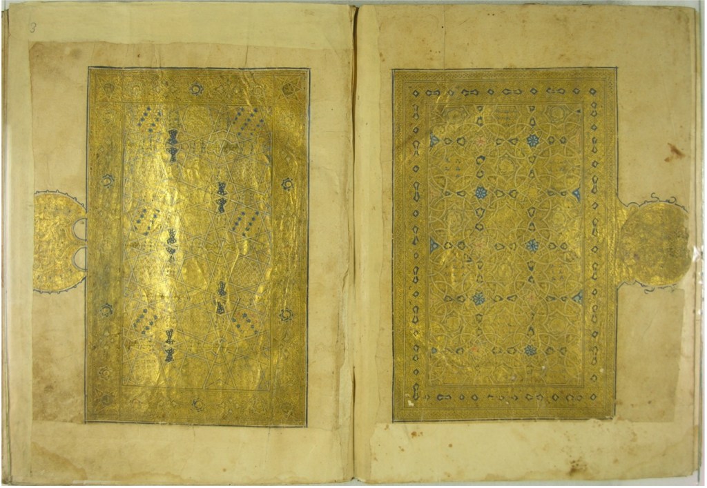
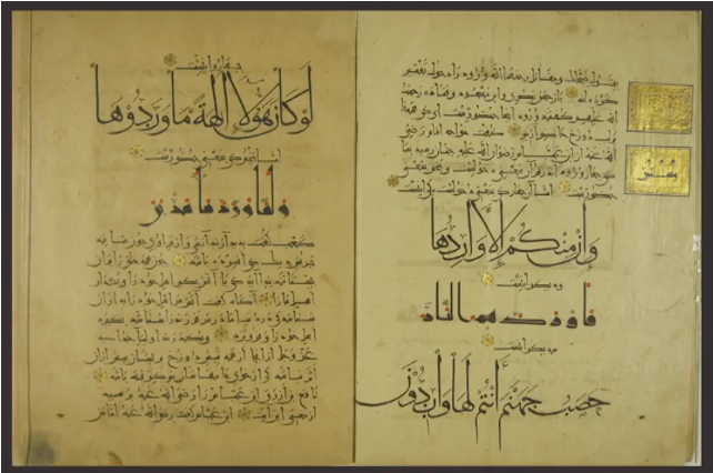
In addition to its calligraphic beauty, the Topkapı Ghaznavid Qur’an exegesis MS. Istanbul TSMK EH.209 stands as a prime example of how curvilinear and rectilinear motifs dominated the artistic scene at that time (fig. 4). The manuscript opening ff.2v-3r are a prime example of the curvilinear style, a design shared by contemporary works in MS. Kuwait, al-Sabah Collection, LNS 6 MS (ff. 1v–2r) and in MS. Munich, Bayerische Staatsbibliothek, Arab 2603. Two curved, illuminated lobes, accented with blue, are repeated symmetrically to form the arch-like motifs characteristic of Ghaznavid design.4 Here, the artist sets these mirrored panels against a vibrant red ground of lotus arabesques. Beyond these central panels, the margins are enriched by a series of vignettes that function as structural markers. These range from almond-shaped medallions housing pious invocations to rectangular panels surmounted by trifid leaves, which signal major divisions like the juz’ or ḥizb. Even the functional elements, such as the gold-leaf rosette verse markers (fawāṣil), are executed with an elegance that reinforces the visual rhythm of recitation.
The structural complexity is further evidenced by the diverse renderings of the ‘unwān (chapter headings). The illuminator, ‘Uthmān al-Warrāq al-Ghaznavī, avoided a monolithic style, instead alternating between compositions of giltcircles, eight-pointed stars, and tripartite rectangular panels. These headings frequently feature elongated angular scripts set against deep blue grounds punctuated by gold stars. Following the frontispiece, the text blocks are typically encased in braided or gold-leafed frames, often resting against delicate backgrounds of black ink spirals or trifid scrolls. This meticulous detail even extends to the orthography; the scribe employed a sophisticated multi-colored vocalization system, using red for short vowels and gold or red for orthoepic signs like the shaddah and sukūn (fig. 5).
©Karame, Alya. “The Imperial Ghaznavid Qur’ans: A Case of Collaborative Productions.” Lecture, Freer Gallery of Art and Arthur M. Sackler Gallery, Smithsonian Institution, January 3, 2017. YouTube video, 29:44. https://www.youtube.com/watch?v=ZzRRHzKQN94 (accessed March 13, 2026).
The artistic significance of MS. Istanbul TSMK EH.209 is derived primarily from al-Ghaznavī’s calligraphic virtuosity and his ability to balance disparate scripts. While the text primarily utilizes the “New Style” (NS)—distinguished by its elongated vertical strokes and barbed terminals—the copyist frequently alternated between scales (NS.I and NS.III) to achieve a harmonious visual hierarchy. As an accomplished court calligrapher, al-Ghaznavī also integrated cursive scripts such as Naskhī and Muḥaqqaq. This versatility is most apparent in the Basmalah, where the letterforms exhibit a deliberate play between thick and thin strokes, as well as in the diverse renderings of the letter kāf, which range from short-armed, flexible tubes to angular forms with shafts inclined at forty-five degrees. Furthermore, the lām-alif ligatures evolve from simple triangular-based ovals to more elaborate configurations surmounted by floral motifs. Together with the varying dimensions of the text blocks, this blending of scripts identifies MS. Istanbul TSMK EH.209 as a hallmark of eleventh-century eastern Islamic manuscript production.
“Together with the varying dimensions of the text blocks, this blending of scripts identifies MS. Istanbul TSMK EH.209 as a hallmark of eleventh-century eastern Islamic manuscript production.”
Aside from its visual complexity, the manuscript offers rare biographical insights about its producers. On folio 3r, the calligrapher-illuminator’s signature is tucked into the corner alongside a humble prayer. The striking similarity between this work and a frontispiece sold at Sotheby’s in 2016 bearing the name Muḥammad ibn ‘Uthmān suggests a shared origin.5 It is highly probable that the Sotheby’s fragment belongs to one of the lost volumes of MS. Istanbul TSMK EH.209, pointing toward a specialized family lineage of artisans at the heart of Ghaznavid production.
Mariem Galy
Mariem Galy is an art historian and curatorial researcher specializing in Islamic manuscripts and material culture. She holds a Master’s degree from the University of Paris-Sorbonne, where her work focused on manuscript production in Central Asia during the Ghaznavid and Ghurid periods (366–612 AH / 977–1215 CE). Currently, she works as an independent specialist for auction houses, museums, and libraries, providing expertise in codicological analysis, palaeography, provenance research, and the authentication of Islamic art objects. Her research is driven by an interest in calligraphy, palaeography, and epigraphy, particularly the visual links between monumental inscriptions and the arts of the book.
- FLOOD (Finbarr B.), Objects of Translation. Material Culture and Medieval “Hindu-Muslim” Encounter, Princeton & Oxford, Princeton University, 2009, p.91 ↩︎
- Karame, Alya. “The Imperial Ghaznavid Qur’ans: A Case of Collaborative Productions.” Lecture, Freer Gallery of Art and Arthur M. Sackler Gallery, Smithsonian Institution, January 3, 2017. YouTube video, 29:44. https://www.youtube.com/watch?v=ZzRRHzKQN94 (accessed March 13, 2026). ↩︎
- Idem ↩︎
- ADAMOVA (Adel T.), BAYANI-WOLPERT (Manijeh), Persian painting: the art of the book and portraiture, London: Thames&Hudson, 2015, pp. 19-25. ↩︎
- Sotheby’s, A Double-Sided Frontispiece Page from a Qur’an, Auction Catalog, October 24, 2007, Lot 13. Available at: https://bit.ly/2Oxoa3u (accessed March 13, 2026). ↩︎

Leave a comment